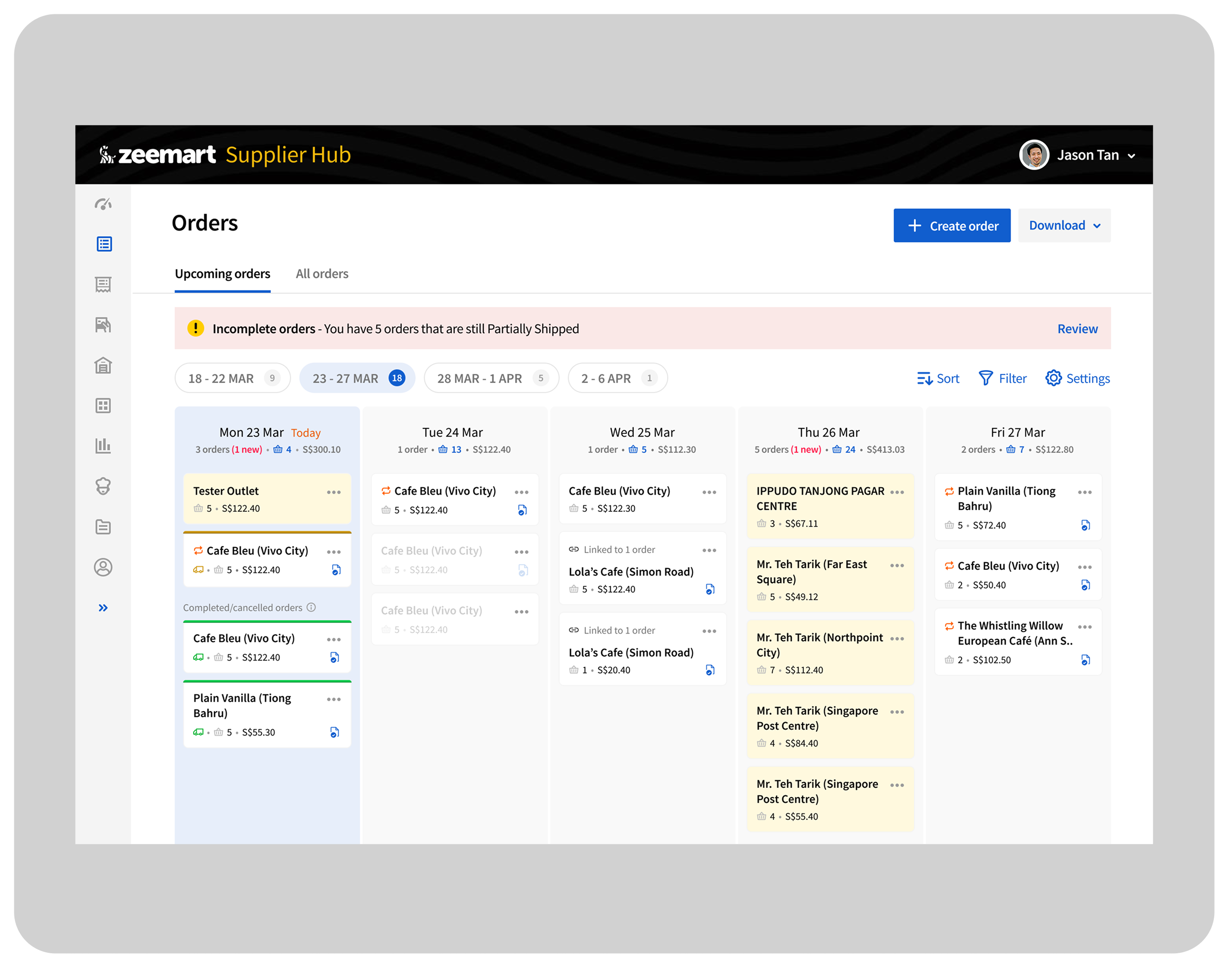
The new Upcoming Orders view, orders grouped by delivery date, with totals and value at a glance.
Bringing kanban-style clarity to Supplier Hub's Orders page
The current Order page lists all orders, but there was room to improve how tasks are surfaced and managed. Inspired by competitor benchmarks and kanban-style flows, I saw an opportunity to make order processing more visible and efficient for teams.
Scope of work included planning, research, concept, designing, and handover.
The new Upcoming Orders view, orders grouped by delivery date, with totals and value at a glance.
Supplier Hub by Zeemart is a platform used by F&B suppliers.
The revamp of the "Orders" page was to make it more in line with the needs of the user. This urgency came from the increasing number of active Supplier accounts joining the platform.
Planned improvements focused on clearer task tracking, better fulfilment insights, and visibility into order stats within the period.
Enable users to view upcoming orders within a defined period, showing total orders, item counts, and order value per day, so they can process and fulfill them predictably and ensure on-time delivery without missing any orders.
Deliverables: new page design.
Suppliers, mostly small to medium sized but also large, including central kitchens. They can work in a small team, and/or have a dedicated admin, fulfillment, or delivery team.
Aligning to our user's needs. Setting us apart from the competition. Bringing something fresh.
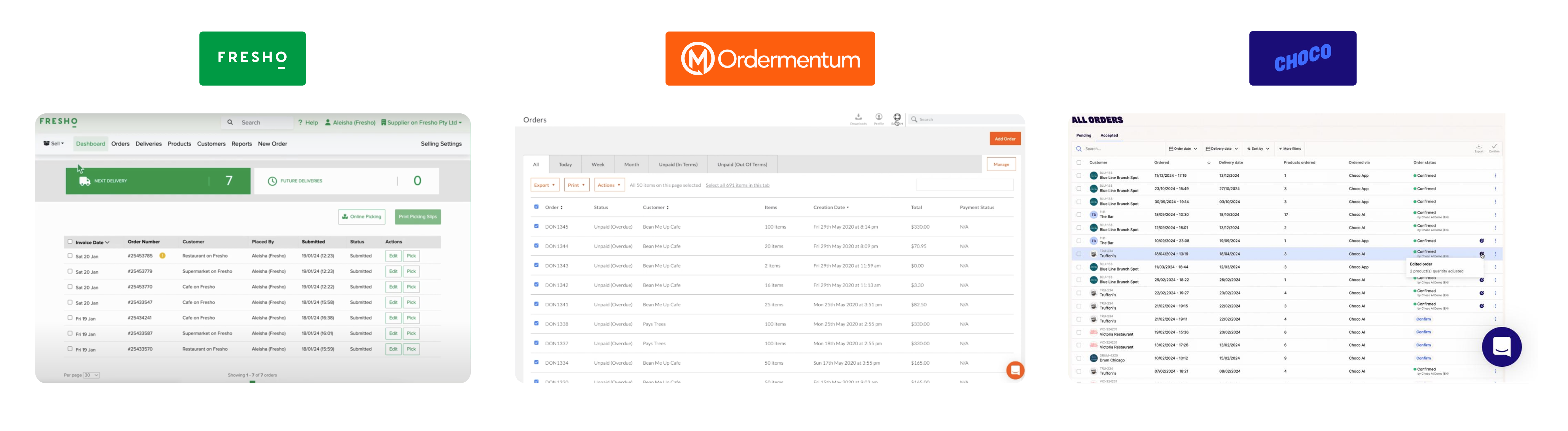
Benchmarking how competitors like Fresho, Ordermentum, and Choco surface upcoming orders.
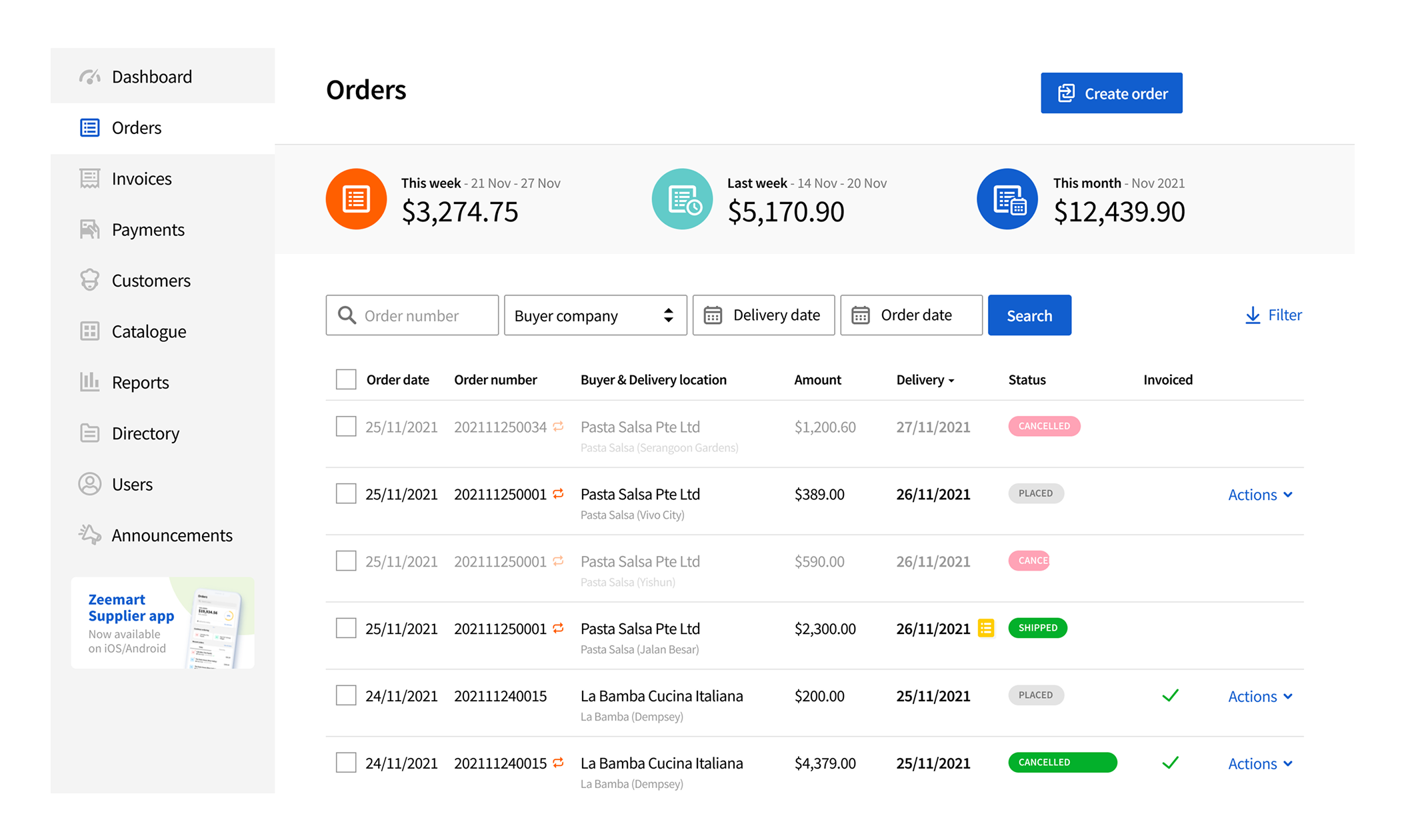
Current design
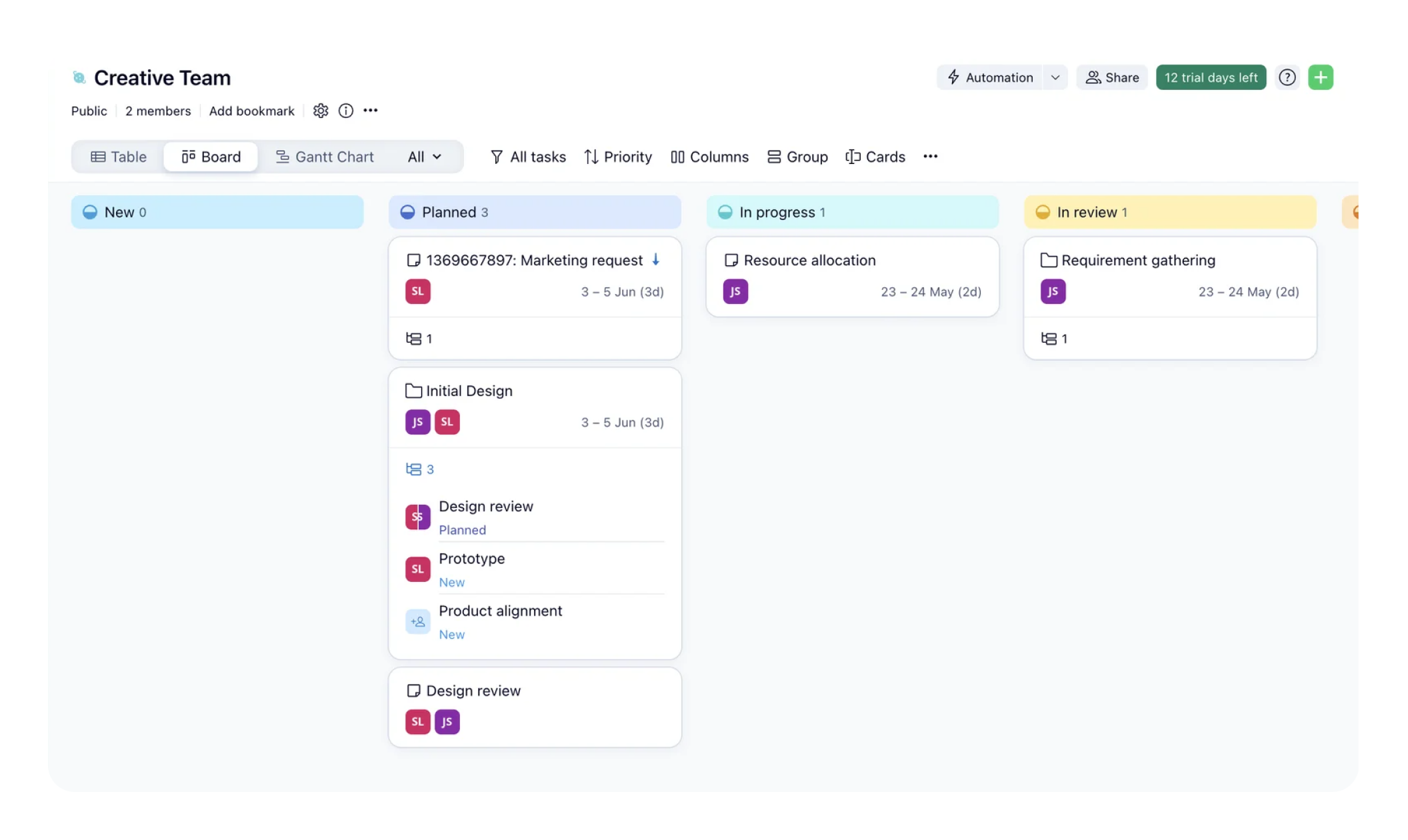
Idea
Inspired by how kanban boards work, allowing multiple orders to be grouped by date or status, this became the approach we considered.
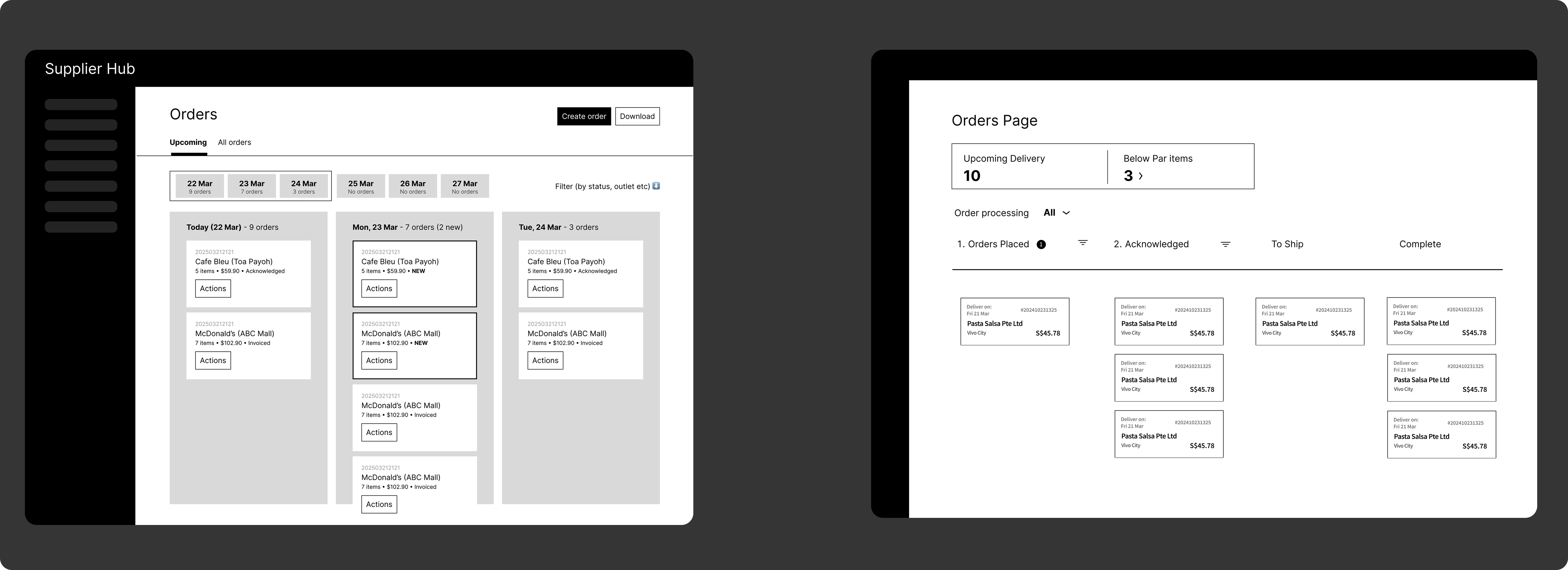
Two directions explored, grouped by date (left) vs. grouped by status (right).
Based on delivery days instead. Not all users' behavior involves setting statuses.
Simplified date display with a set number of columns, making dates dynamic so users can stay on top of things.
Allow users to keep using the current (list) view.
Summarize items to be fulfilled for that day.
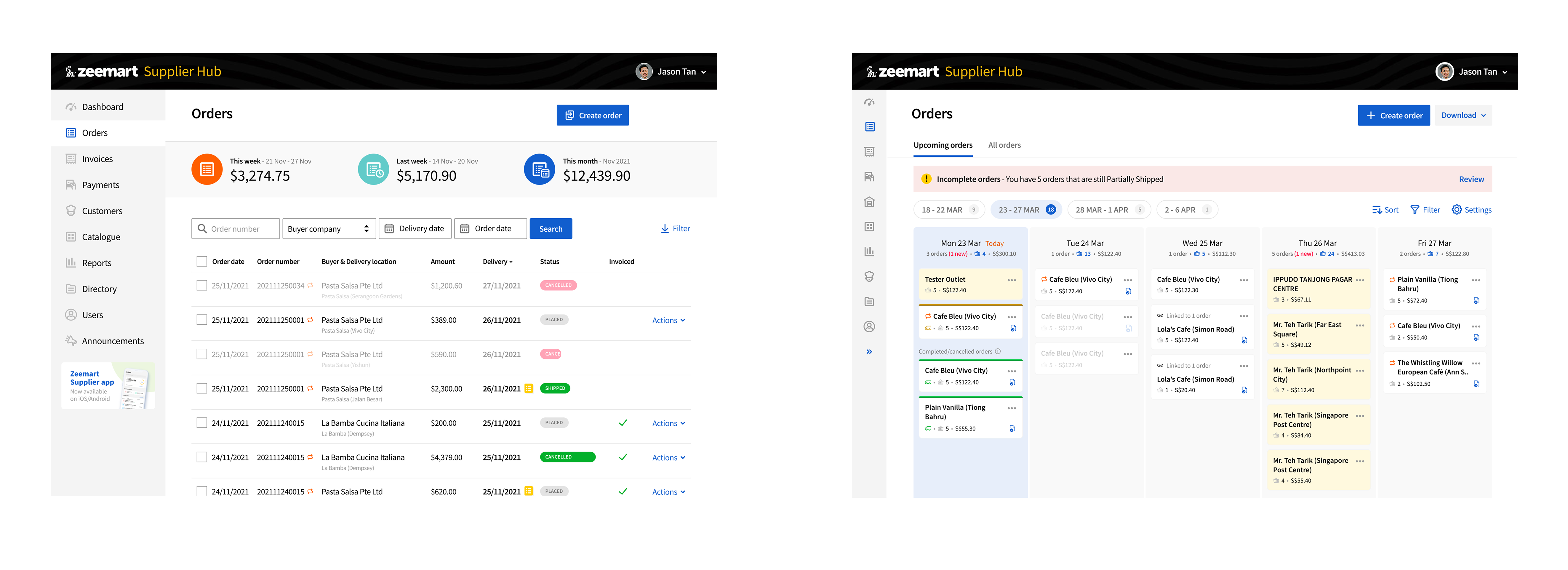
List view, existing (left), vs. the new Upcoming orders view (right).
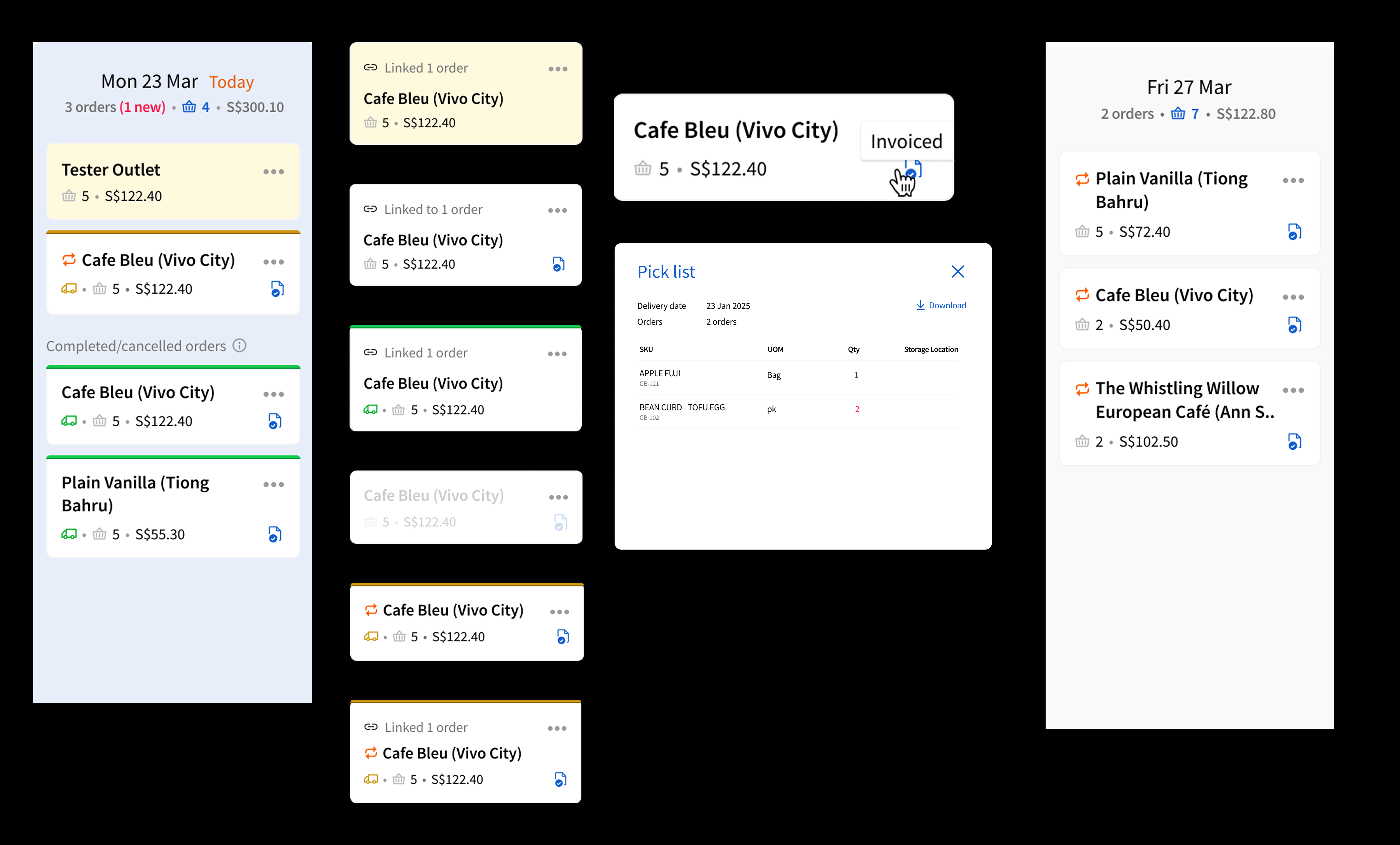
The packing list pulls together everything that needs to ship for a given day.
When building a feature, talking it through is important, but checking the data can really help point us in the right direction.